When it comes to your email marketing, how do you assess the performance of your Flows and Campaigns? Key performance indicators (KPI’s) are very important for evaluating your marketing. However, these can be hard to come by and most of us are looking for more than ‘just a finger in the air’ guess.
The idea of email benchmarks may be something that is familiar to you and is something that has been around but not easily accessible. However, Klaviyo has now created an in-app tool that looks at your email performance and compares it to the results of others within your industry. This tool is known as Benchmarks.
Where can I find Benchmarks by Klaviyo?
To be eligible for benchmarks in your Klaviyo account, you need to have sent at least 25 emails in the last 6 months. You should also make sure you have selected your specific industry to access industry-level benchmarks.
To access your benchmarks, head to the Analytics tab on the left-hand side. This will open a new page where you’ll have 3 tabs to choose from. Selecting Benchmarks will navigate you to the Benchmarks overview page.
How does Klaviyo choose my peer group?
Klaviyo determines your peer group by selecting 100 companies using Klaviyo who are most similar to your business. This is based on the industry you select as well as your business characteristics.
At the bottom of all pages in Benchmarks, there is a drop-down called “How we choose your peer group”. Here you can view your characteristics as well as a breakdown of the industries in your peer group.

This may give some indication on how your Klaviyo is set up and currently running. For example, if you look at the other industries and feel none relate to you, you might need to change your industry.
Read Klaviyo's blog here to understand more about peer groups and industry benchmarks.
How can I use Benchmarks?
Benchmarks are a great way to gain more insights into how you are performing against other brands in your industry. On each insight, there are two main areas to help explain your results, Status and Percentile.
Percentiles measures how your business performs compared to your peer group. For example, if you are in the 76th percentiles, you perform 76% better than your peer group. This leads us onto Status.
Status is defined as Excellent, Good, Fair and Poor. These status’ are decided by what percentile you are in:
- 0 - 25th Percentile = Poor
- 25th - 50th Percentile = Fair
- 50th - 75th Percentile = Good
- 75th - 100th Percentile = Excellent.
To view these insights you will have 4 pages to view:
- Overview
- Business Performance
- Campaign Performance
- Flow Performance
These tabs display different data points that are relevant to your business, campaigns or Flows. Let’s break each page down.
Overview
Overview is a great page to view if you want to get a glance at what’s performing well and isn’t performing well. Out of all, it’s performance indicators, Klaviyo pulls out the top 5 best and worst metrics and displays:
- Where they’re from
- What their status is
- Your Value
- Percentile
You can also toggle the data range on this page selecting, Months, Quarters or Custom. Below is a video to demonstrate how to use this page:
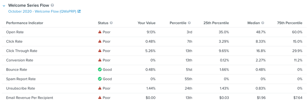
The Overview Page is a good way to see what area you need to focus on if looking at Klaviyo as a whole. These performance indicators can be used to establish key working points for your month and then further deep dive into them to see how you perform against your peer group and the median of others.

In the example above we can see that our Open Rate for Flows is currently poor. Therefore now known it would be good to implement Subject Line A/B testing to improve Open Rate. We’ve been able to make this decision based on very clearly presented data. This page reduces the amount of time spent on diving into data and increasing time spent on working to improve the data.
Business Performance
The Business Performance page focuses on how your business performs against your peer group and how it performs against others. Klaviyo offers a bar graph to show you visually how you are performing.
The metrics on this page focus on your business rather than your campaigns or flows and looks at:
- Average Order Value
- % of Orders Returned
- Average Cart Size
- Average Order Count
For the bar graph, you need to toggle between the metrics if you want to view it visually, but Klaviyo has also included a table like on the Overview Page to show you all of them at a glance.
You will need to have had orders placed for data to show here, but it still works for identifying KPIs for each of these areas.
Here is a video to show you the page in action:
What’s great about this page is that you get data you ordinarily wouldn’t be able to find. One of the main purposes of Klaviyo is to reduce your cart abandonment rate and increase the number of orders as well as the value of the order. The Business Performance page gives you the data you need to know if you’re on track or if you need to make adjustments to your Abandoned Cart Flow or your upsell emails.
Campaign Performance
This page focuses purely on your Campaign performance, using the key metrics that you are used to seeing with your campaigns like open rate, click rate and conversion rate. But what this page does that is slightly different from basic analytics, is divide out these metrics by marketing performance and deliverability.
Dividing out these two sections, gives Klaviyo users to clear areas to work on:
- Marketing Performance focuses on the quality of the content and clickability
- Deliverability Performance looks at the segments or list sent to and their engagement with your emails.
This video shows you more:
These benchmarks help marketers determine where they focus should be. It’s likely if you see you have poor deliverability then your marketing performance will also be poor, so merchants will be able to answer the question: ‘Is it my audience or my content?’
If your deliverability performance indicators are poor, try looking at your segments and sending to those who are engaged. Klaviyo provides some great guides on segmentation, this is a particular favourite here at Blend. Once you tackle your deliverability issues, you will notice your marketing performance is boosted.
Flow Performance
Flow Performance is possibly the most powerful part of Benchmarks and gets into the nuts and bolts of how your Flows are performing. Just like with Campaigns you have your usual benchmarks available to you but instead of just having overall Flow performance, it also divides down into your key flows.
Key flows typically for Klaviyo include:
- Welcome Flow
- Cart Abandonment Flow
- Browse Abandonment Flow
- Thank You/Post Purchase Flow
These flows are ones that are designed to build trust, increase revenue, develop custom relationships and are often associated with the metrics seen on the Business Performance Page.
From this, you can easily see what areas of you Flow are performing well and what you could look at improving. Below, we look into this page and explain how to use it:
Being able to quickly see how your Flows are performing is a blessing within this tool. Before you either had a brief overview of performance on the Dashboard, or you'd have to export the analytics of your Flows.
The visual representation of the graphs, allows marketers to quickly know what areas they need to address. For example in the image below, we can instantly see the open rate needs improvement. This means we can now take a logical approach to improve the flow because if your open rate is low, fewer people are opening the emails which mean there is less opportunity to click or convert. So if you improve your open rate by proxy you should be able to improve your click and conversion rate.
What we think about Benchmarks by Klaviyo
As long time users of Klaviyo, it’s great to see steps being taken to aid Shopify Merchants in analysing their data.
The Status Column is a feature we think is very helpful. At a glance, you can see how you’re performing without the need of finding the exact data. This allows you to focus your time on optimising your marketing, which is where you will see your main growth.
We’re also very impressed by the Business Performance page. We feel the metrics here help put email marketing into perspective and reiterates the goals we are trying to achieve. It finds and reports on data points that you wouldn’t normally see in Analytics and creates a goal for you to achieve with your Flows.
As an agency, we like to report on the whole picture with Klaviyo so we would like to see this tool allow more Flows to be added to the Flow Performance page. There might be instances where our Overall Flow Performance for Open Rate, for example, is below our Peer Benchmarks but the Welcome Flow, Cart Abandonment Flow, Browse Abandonment Flow and Thank You Flow are all above the benchmark. By process of elimination, we know the 4 main Flows are not the reason our overall Flow performance is down but we don’t know exactly which Flow is causing the issue. By displaying all Flows on this page, we’d have a better understanding of where our Flows are falling short. For this same reason, we’d also like to see the Campaigns page divide out your campaigns and show the individual metrics for the Campaigns sent in the time period you select.
We think Benchmarks by Klaviyo is a great tool for newer Klaviyo users. The simplistic and clear layout of data will allow new users to easily understand the performance of Klaviyo across all areas and work towards growing their email marketing. The peer group benchmarks also create good starting point KPI’s to achieve whilst you start to bring data into your account. Once you reach those KPI’s you can then start looking at improving your performance month on month with A/B testing and a better understanding of the metrics available to measure in Klaviyo.
Learning from Benchmarks results
The Klaviyo Benchmarks Tool provides a quick but in-depth overview of how your email marketing is currently performing and it’s important to use this data to make the adjustments necessary for business growth.
Using these Benchmarks as your KPI’s is a great way to ensure your email marketing is on the right track and you have something to aim towards.
Whenever you see a metric marked as Poor or Fair take some time to dig deeper and find out why this is the case and implement a strategy to address this. There are plenty of resources available to you to help improve your benchmark performance.
If you’re looking for additional support with your email marketing, Blend provides a Klaviyo Flow and Campaign Consultation and Management service. As a certified Klaviyo Master Partner, we’ve been able to increase revenue from Klaviyo by 173%. Find out more here.