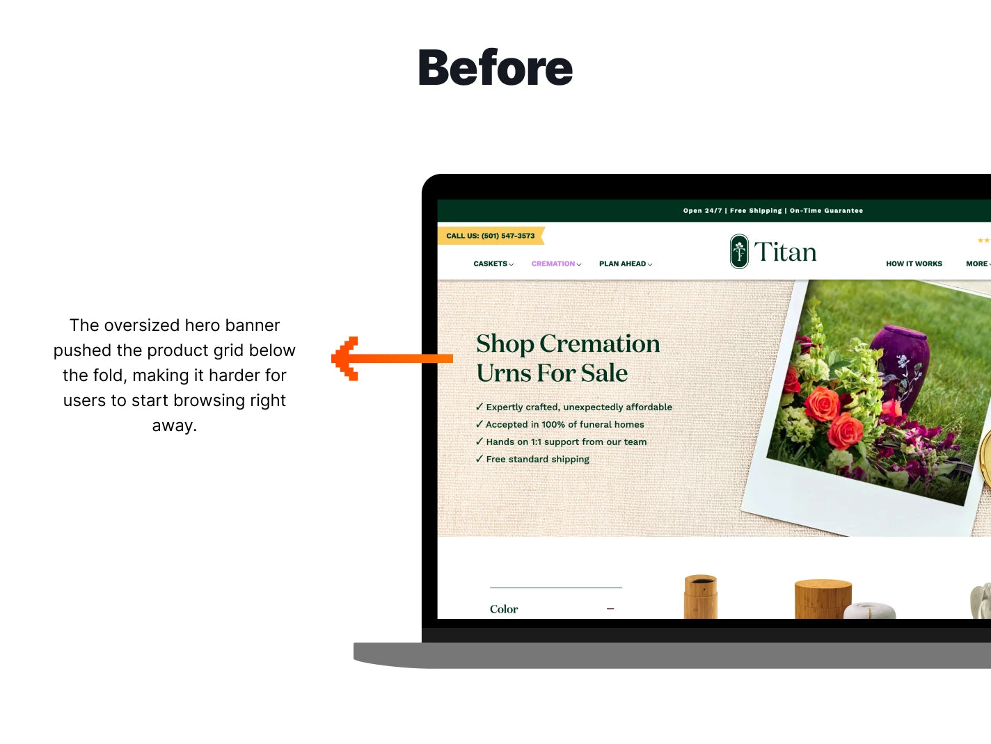
A/B Test

What the Data Told Us

During our CRO Insights service for this brand, we noticed that the hero banner on the collection pages took up additional space, pushing down the product grid. For an eCommerce site, one always wants to ensure that customers can get to the products as quickly as possible and not being able to see the product grid immediately could hinder the purchasing experience.
Jump to results

Hypothesis

How the Test was Set Up
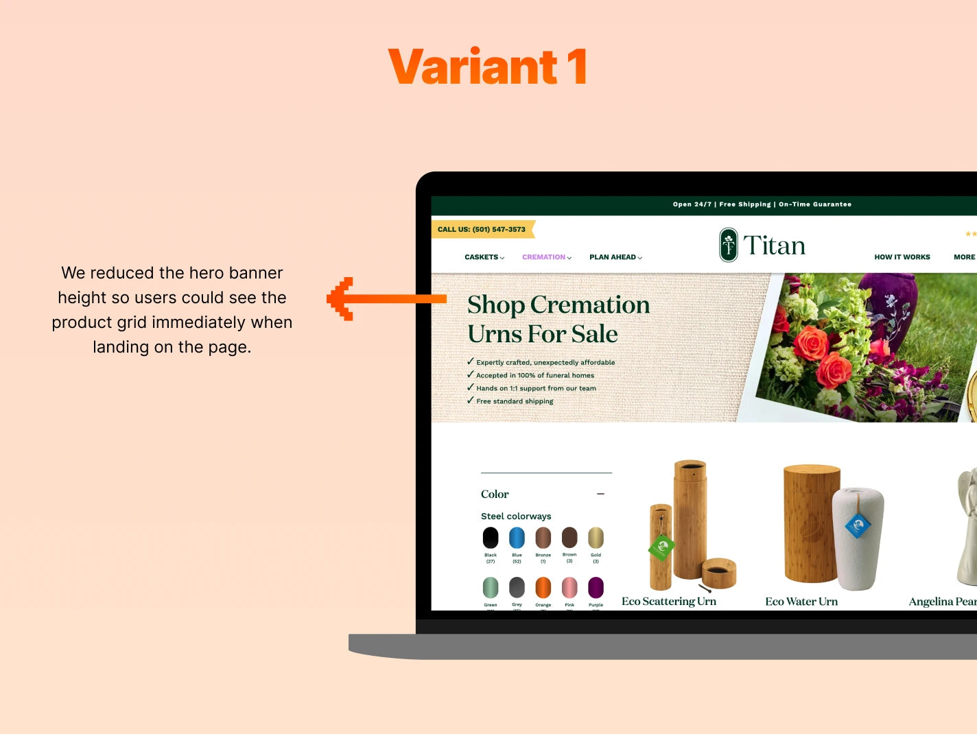
We created a variant with a slightly smaller hero banner on collection pages. We wanted to test how small a change could have on all conversion metrics. The original had the hero banner taking up additional space and pushing the product grid below the fold while the variant allowed users to see the top of the product grid immediately.

The Results

After two weeks, we analysed the results. The metric changes were exceptional, specifically for desktop devices. Variant 1 showed an Overall 35.52% increase in Conversion Rate and a 34.93% increase in Revenue per Visitor while for Desktop devices, we saw a 112.74% increase in Conversion Rate and 196% increase in Revenue per Visitor.

We implemented Variant 1 permanently.

  • 112.74%

    Increase in Conversion Rate for Desktop Devices

  • 196%

    Increase in Revenue per Visitor for Desktop Devices

  • 35.52%

    Increase in Conversion Rate Overall

Video testimonials

GET IN TOUCH

Let’s talk about your business.

5.0 on Reviews.io

GET IN TOUCH

Let’s talk about your business.