A/B Test
What the Data Told Us
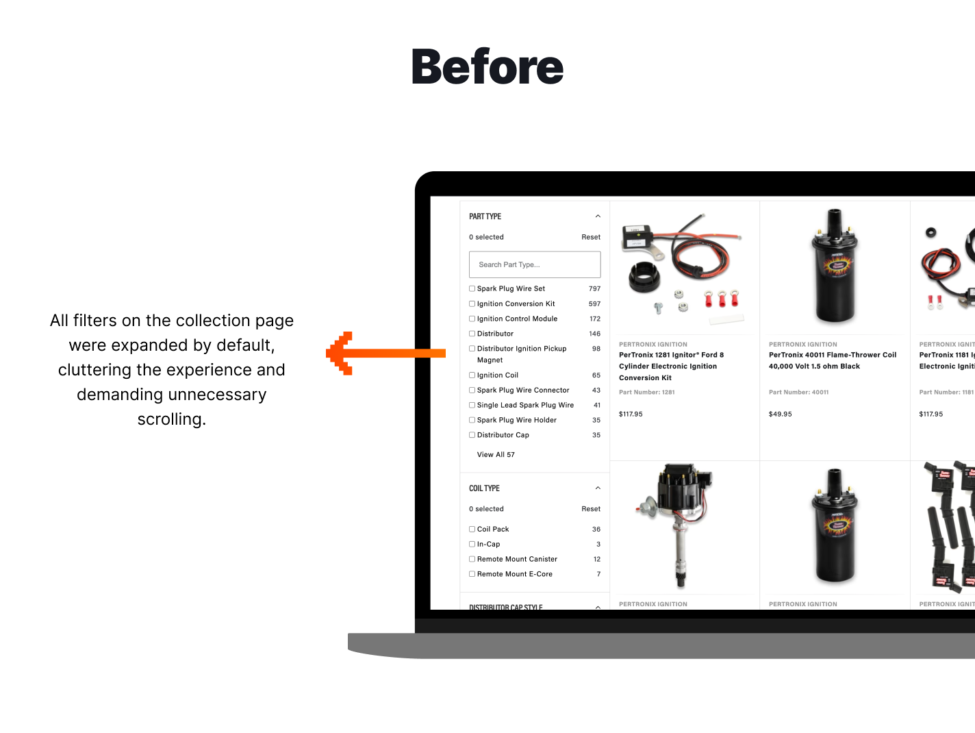
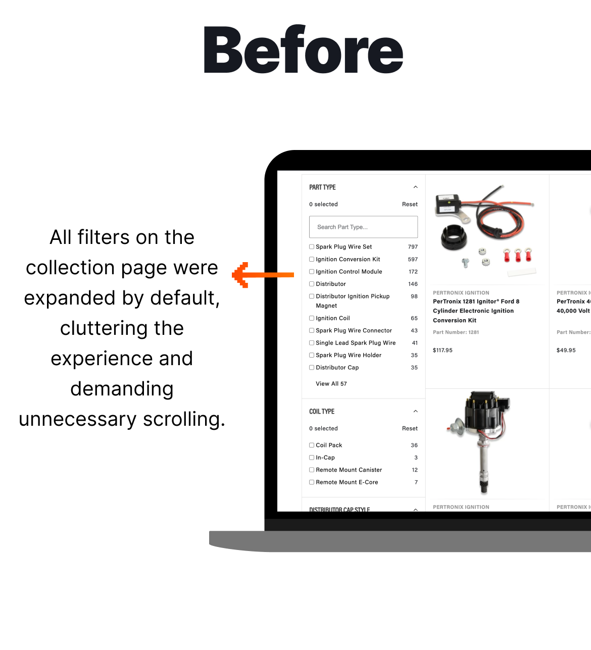
When looking through the client’s site to determine any elements which might cause friction, we analysed the filters on collection pages. Due to the industry, the filters are extensive and necessary, but they took up mental focus when trying to determine which products the user needs.
Jump to results
Hypothesis
How the Test was Set Up
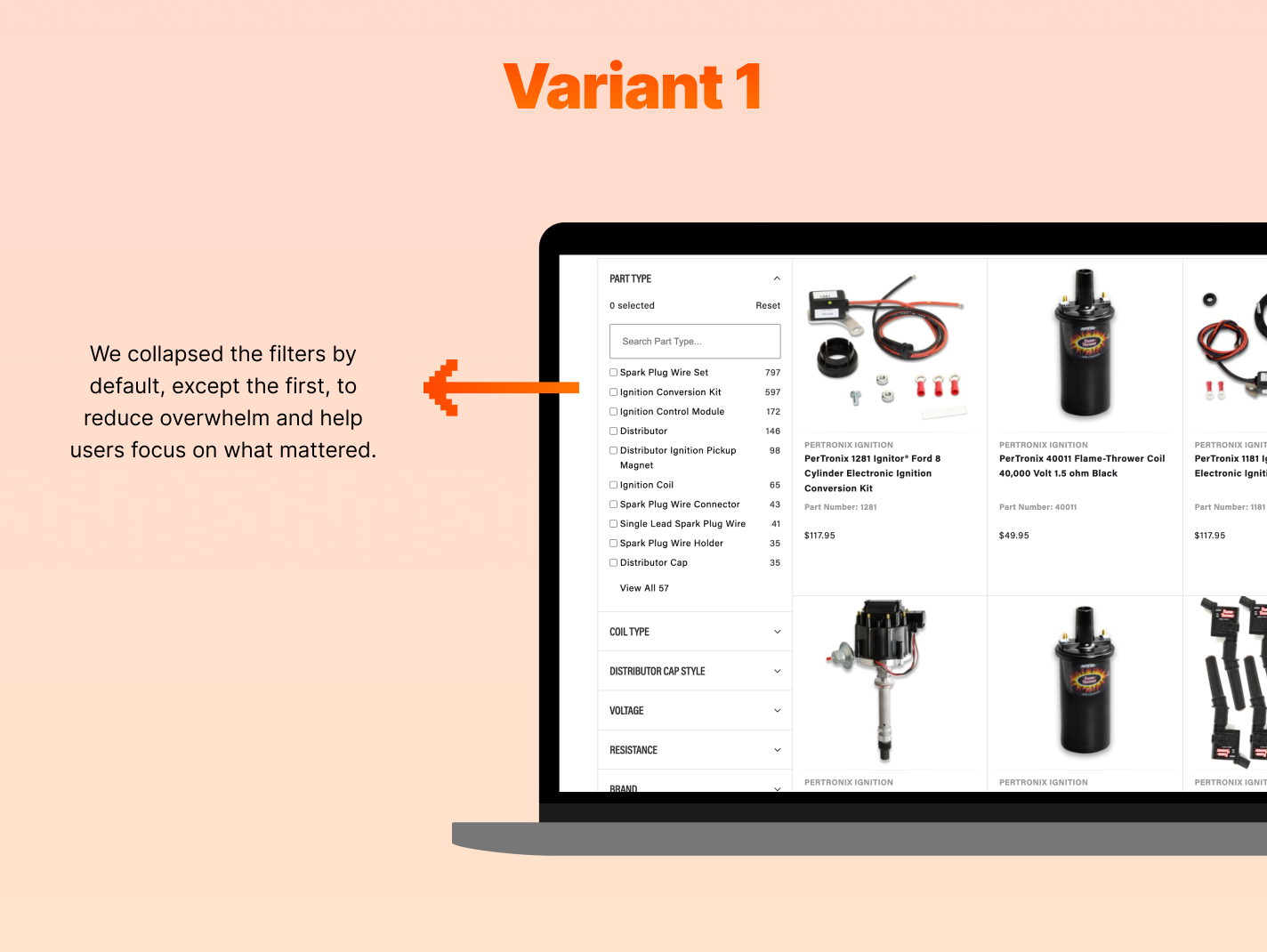
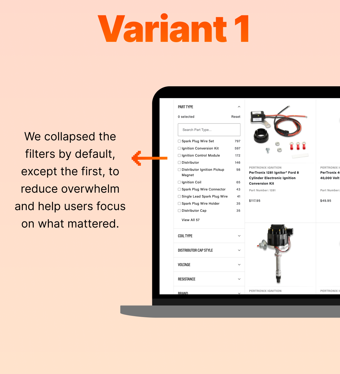
We hypothesised that by closing the filters by default, the user could edit only the filters they were looking for at a glance. We created a variant where all the filters were closed by default, except the first one, while the original (control) presented all filters open, requiring users to scroll to see all available filters.


-
 Search & Navigation
Redesign Mobile Menu
Could making the category menu more visual help users navigate faster, explore more products, and increase conversions and revenue?
-
 Search & Navigation
Utilising Story Widgets
Does redesigning category navigation with clearer, circular icons improve mobile conversions and subscription revenue?
-
 Collection Page (PLP)
Utilising Sub-Category Widgets
Will adding sub-category widgets on a collection page increase overall revenue?


