Apparel Brand
26% Increase in Conversion Rate
A/B Test
Homepage Above the Fold Optimisation
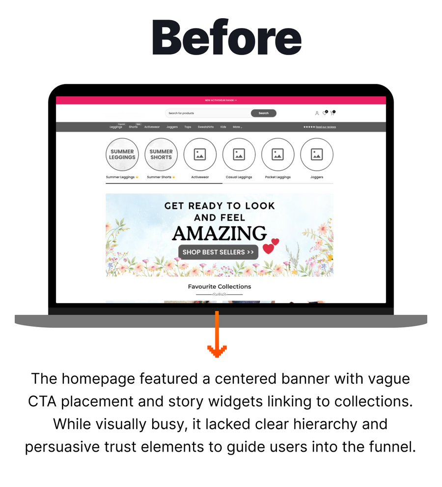
Based on our heatmap and session recording analysis, this client in the apparel industry was ready to improve their homepage above the fold with the goal of increasing brand trust, visual hierarchy, and conversion funnel guidance. The client took the lead and put forward a layout idea for us to test and we began strategising the best way to display the information needed.
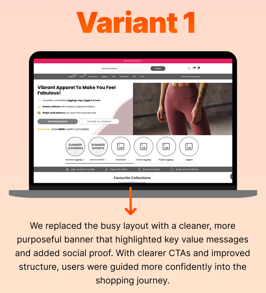
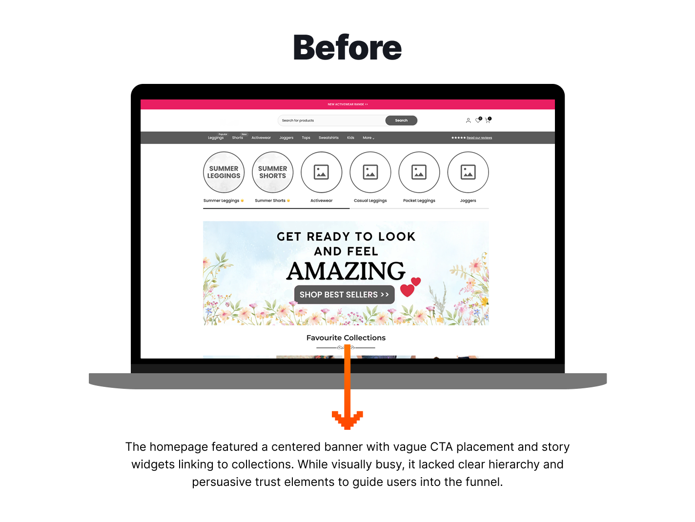
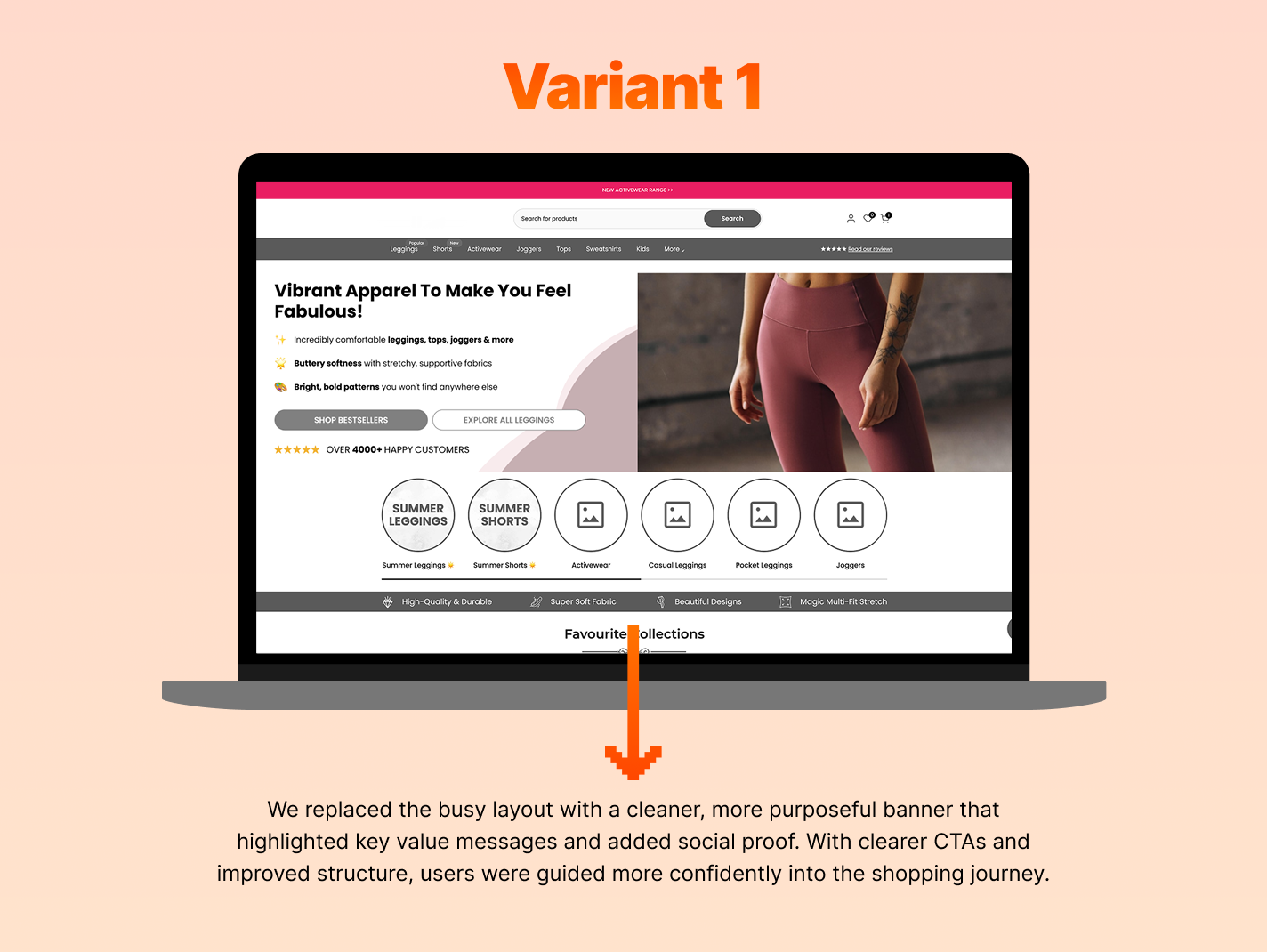
We began with designing the home banner on the homepage. Originally, the client had story widgets which would guide users to collection pages, along with an overwhelming center-focused banner. The banner featured an image background and large CTA, which was part of the image and had unclear edges. For the test, we designed the variant to remove the story widgets, and create a banner that was clear and action-driven. The banner bullet-pointed key value propositions along with copy mentioning “over 4000+ happy customers”. The banner included a primary and secondary CTA that was clear visually and action-based.
The Results
After two weeks, we analysed the results. While this test was presented on both mobile and desktop devices, desktop metrics increased but mobile devices decreased in both conversion rate and average purchase revenue per user. For this reason, we ended the test with Variant 1 live permanently on desktop devices only, with the goal to feature alternative changes on mobile in future.
-
26%
Increase in Conversion Rate for Desktop Devices -
27%
Increase in Average Purchase Revenue per User for Desktop Devices -
8.27%
Increase in Add to Cart Rate
More A/B Tests
-
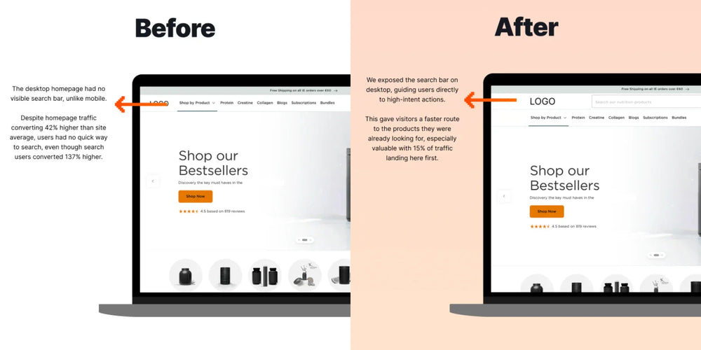
Exposed Search Bar on Desktop

Could you improve Conversion Rates by exposing the Search Bar on Desktop?
-
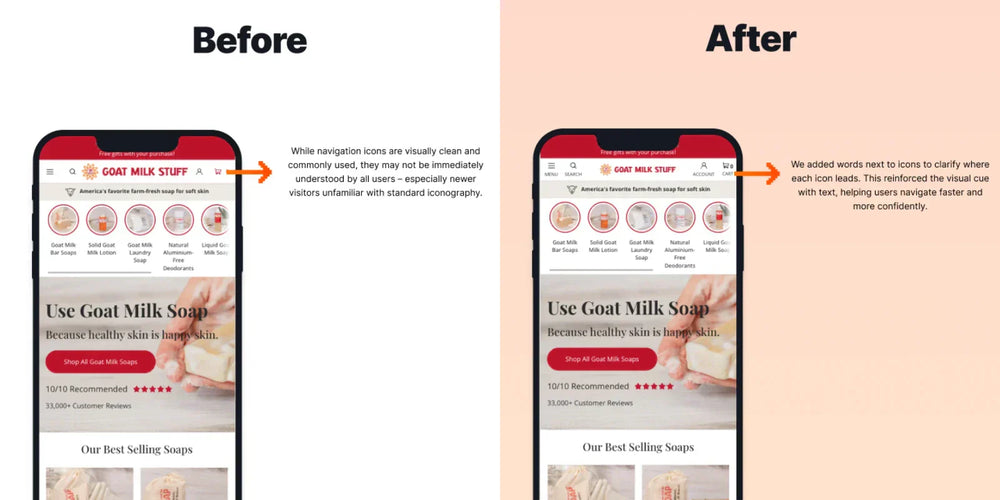
Words with Icons in Navigation

Could Adding Words to Icons in the Mobile Nav Improve Conversion Rate?
-
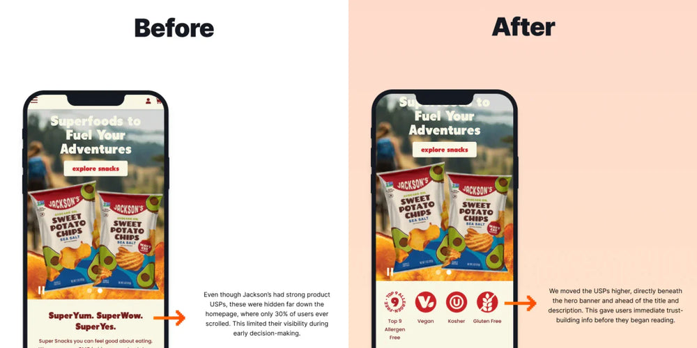
Optimise USP Section on the Home Page

Does Moving USPs Higher on the Homepage Improve Conversion Rate?
GET IN TOUCH
Let’s talk about your business.
GET IN TOUCH
