A/B Test

-
 Collection Page (PLP)
Sticky Filter and Sort on Mobile Collection Pages Boosts RPV 95%
Keeping filter and sort controls persistently visible on mobile has a massive impact on revenue performance through better product discovery, with revenue per visitor up 95%
-
 Homepage
Highlighting Best Sellers on the Homepage Improves Revenue per Visitor
Showcasing best-selling products on the homepage can improve product discovery and increase conversions
-
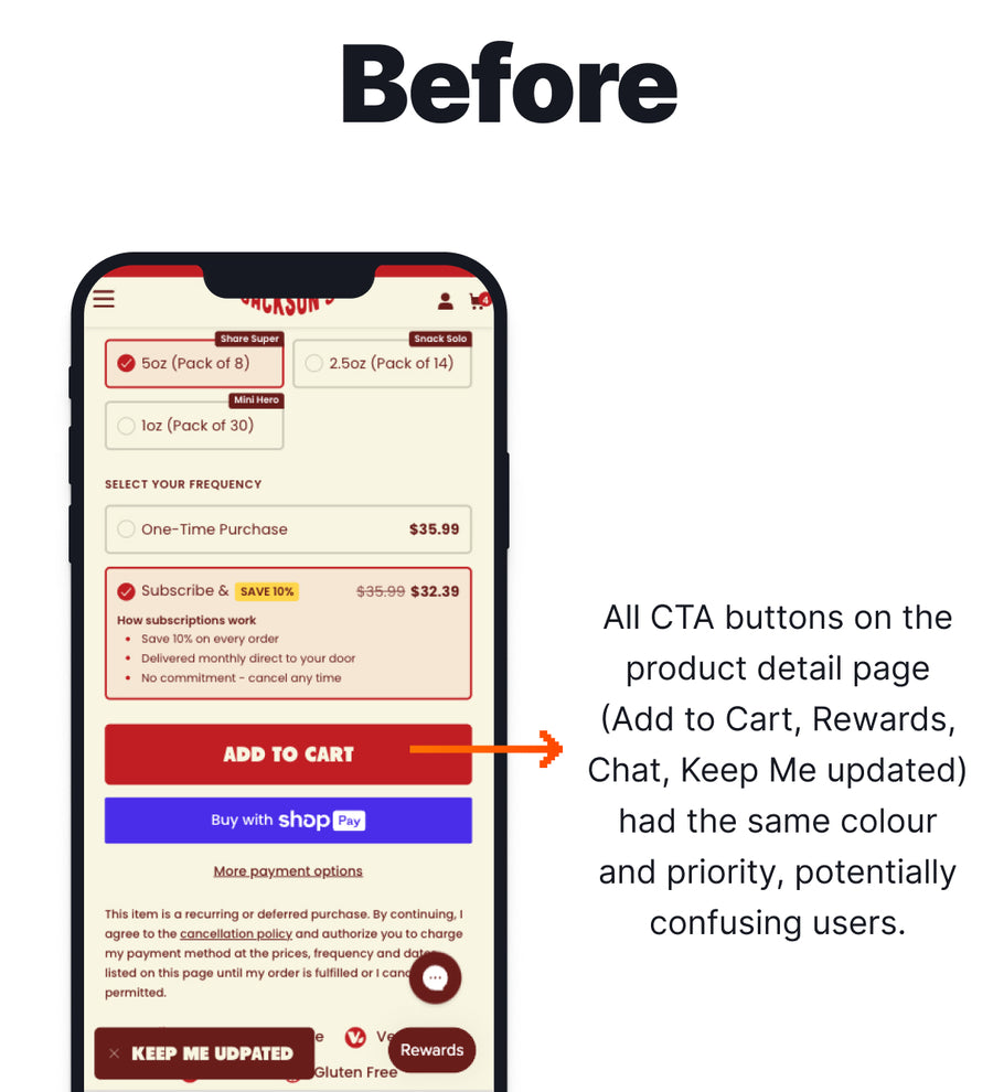
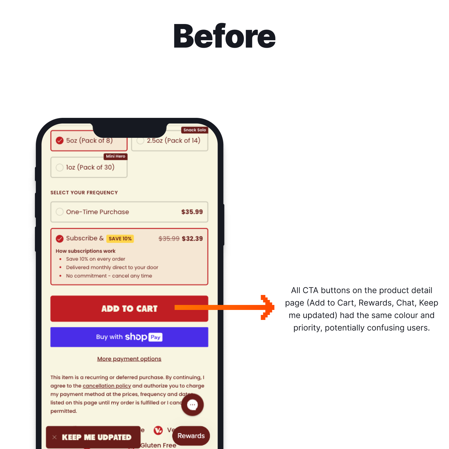
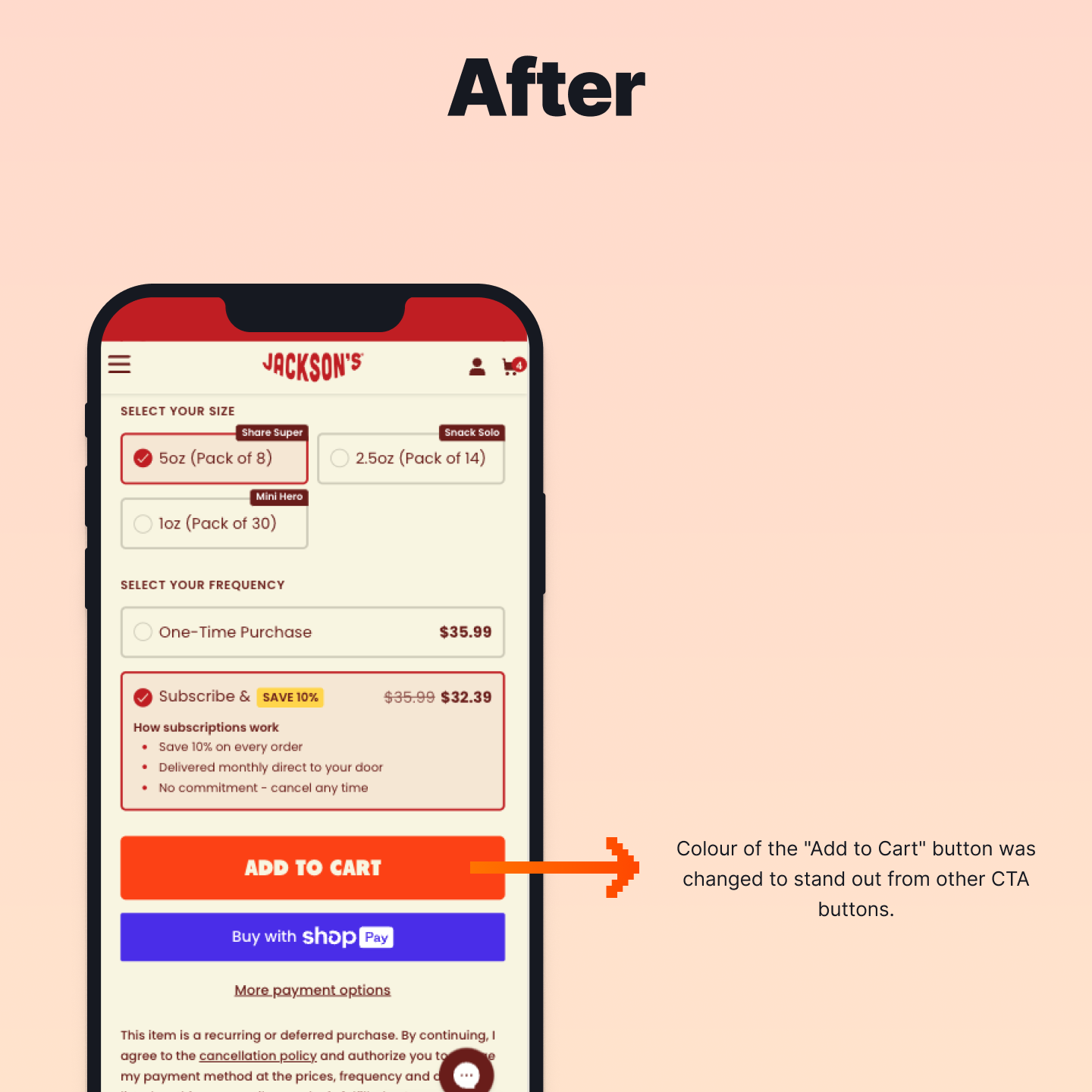
 Product Page (PDP)
Drive Subscription Conversions with Different Frequency Selectors
Can replacing the subscription frequency dropdown with quick-select pill buttons improve subscription engagement and conversions?


