Apparel Brand
11.11% Increase in Revenue per Visitor
A/B/C/D Test
Optimising Mobile Navigation Menu
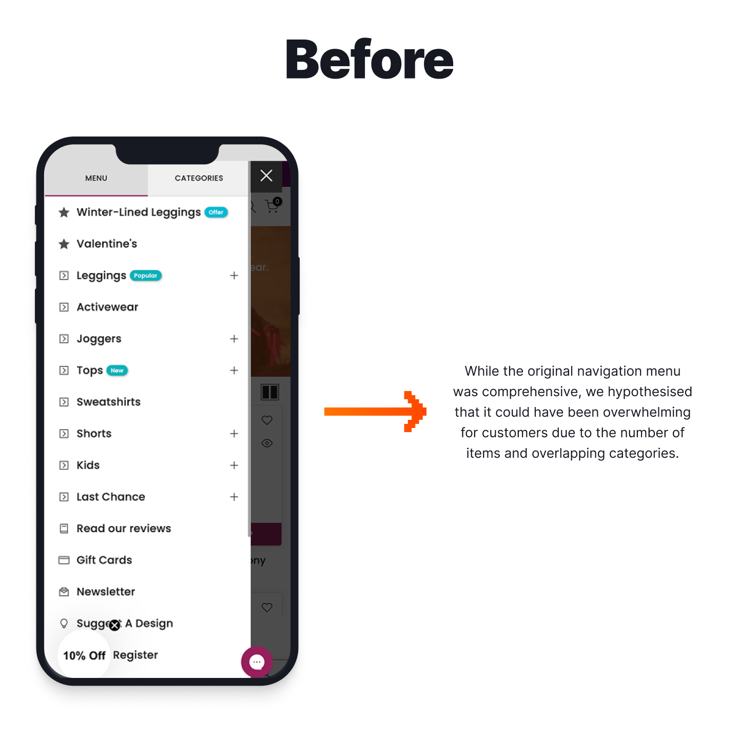
While the current navigation menu was comprehensive, we hypothesised that it could have been overwhelming for customers due to the number of items and overlapping categories. Customers using the menu are looking for something specific or looking at what the brand provides. The client was displaying sections like “Last Chance” and “Activewear,” which was generalised and made navigation less intuitive. Cohesively presenting these categories and sub-categories will guide users through the customer journey to collection pages and product detail pages.
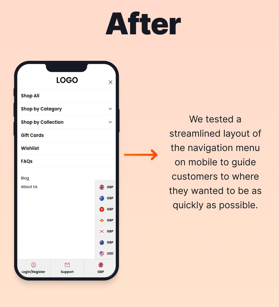
We hypothesised that a streamlined layout of the navigation menu on mobile would guide customers to where they wanted to be as soon as possible. But, we were aware that there were many ways to accomplish this. For example, while presenting a streamlined layout was the goal, there were additional elements we wanted to test, including displaying imagery in two different ways. For this reason, we conducted a multi-variant test, basing three variants against the original.
Variant 1 displayed the basic new layout that streamlined navigation.
Variant 2 displayed example imagery alongside the main categories.
Variant 3 displayed larger blocks of imagery for the main categories.
These optimisations reduced redundancy by moving subcategories to filters within collection pages to ensure the menu focused on broader categories. It also simplified navigation by clearly separating product categories and themed collections, which aligned with how customers naturally shop. Lastly, it enhanced the shopping journey by making gift cards and wishlists easier to find, helping customers focus on their purchase intent.
The Results
The multi-variant test revealed that simplifying the mobile navigation had a significant impact on how customers explored the store. All variants improved revenue per visitor, but Variant 1, which focused purely on streamlining the menu without adding imagery, delivered the strongest overall performance.
By reducing clutter and guiding users more intuitively, Variant 1 drove higher conversion rates, increased average order value, and saw a dramatic rise in engagement with the navigation menu. Customers were able to find what they needed faster, leading to more efficient journeys from browsing to checkout. Based on these results, Variant 1 was implemented permanently to enhance the mobile shopping experience.
-
3.62%
Increase in Conversion Rate -
8%
Increase in Average Order Value -
5270%
Increase in Engagement with Navigation Menu
More A/B Tests
-
Product Page (PDP)Adding a Back Link to PDPs Improves Mobile Revenue per Visitor
A simple “Back to Results” link helped mobile shoppers return to browsing more easily and delivered a projected monthly revenue lift.
-
Product Page (PDP)Accordion PDP Content Improves Desktop Conversion
Structuring PDP content into accordions created a strong desktop win, and showed why mobile shoppers need key information visible sooner.
-
Search & NavigationRedesigning the Mobile Category Menu Strengthens Funnel Engagement
A redesigned mobile category menu helped shoppers move more confidently from browsing to cart and checkout.