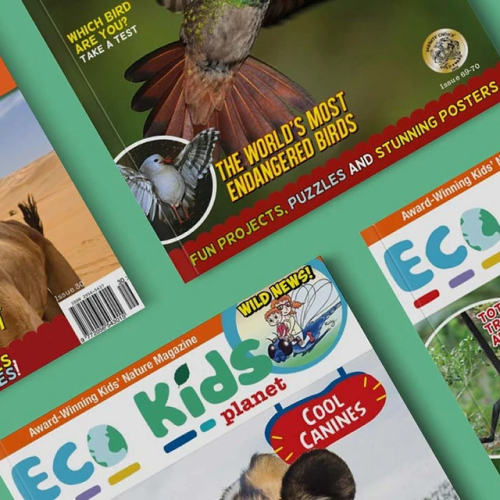
Eco Kids Planet approached Blend with a challenge of retaining their huge customer base through their site. We understood early on that they had one focus of a simple experience to help the users navigate the site and to understand exactly what Eco Kids Planet do and why they do it.
The Problem
Eco Kids Planet approached Blend with the challenge of retaining their huge customer base through their site. We understood early on that they had one focus of a simple experience to help the users navigate the site and to understand exactly what Eco Kids Planet do and why they do it. Prior to working with Blend, Eco Kids Planet experienced a drop in revenue from Q2 2020 to Q3 2020 of 45%, and this was something that we understood that needed to be tackled immediately.
Following our initial analysis, we realised that some specific actions were needed to make this happen. The add to cart button was quite low down below the fold, so this was addressed as a matter of priority. We also felt that we needed to simplify the call to action and make the user experience a little more seamless. Users naturally scroll down first and then go back up and browse in an F/E direction which is a known tool of User Experience and we wanted to improve this for Eco Kids Planet.

What We Did To Help
Blends initial analysis included Hotjar analysis, the creation of a Google Analytics Audit and UI/UX report. By using this research, we designed desktop and mobile versions of the site to focus on what we’d observed.
We also felt that the Eco Kids Planet branding needed to be strengthened to give the clarity that the client was looking for. By using existing colours and changing their fonts to have clearer branding across their site, we felt that we were able to achieve what was needed.
Key learnings from these reports were:
- Seamlessness Experience
We needed to create a more seamless shopping experience for users to navigate the website more easily. - Retain Subscriptions
Existing subscription customers are the main source of income. Eco Kids were losing them, and we had to make sure to retain as many of them as possible. - Focus on Products
The products needed to be more of the focus as people didn’t know what they were shopping on the site.
Blend implemented some upgraded design features to the website by improving the home and product pages and really focusing on what Eco Kids Planet sells - magazine subscriptions for kids. We also focused on navigation, making the entire checkout process simpler and easier.
Navigation is critical for any website. It’s the place that near enough everyone uses to easily journey through a website. A navigational bar at the top of a website is a piece of UI that contains useful links across a website. Having the right kind of links within the navigation is highly important - some studies have shown that up to 50% of sales could be avoided due to users not being able to find the correct information quickly enough.
It should be logical, secondly, it needs to be intuitive, it needs to be structured properly, clear, consistent, simple, visual - but most importantly - accessible.
This is why navigations are important - well best practice really. This is why Blend approached the navigation with Eco Kids Planet with a goal in mind to make it easier and more accessible for users (giving more pages for SEO).


The Results
Eco Kids Planet has seen remarkable results in the three months since the store redesign went live. Not only are conversions up by 13%, but the Average Order Value is up by 48% too. We have seen an increase in Direct Traffic by 53% as well as a Revenue increase of 54%. Quarter 4 has increased by 41%.
-
54%
Increase in Revenue -
13%
Increase in Conversion Rate (CR) -
54%
Increase in Direct Traffic
More Case Studies
-
 TEKLED
How a Shopify Redesign Boosted TEKLED’s UK eCommerce Growth
Discover how a full Shopify redesign improved UX, SEO, and site performance, driving higher conversions and order values for TEKLED’s UK store.
-
 Titan Casket
Titan Casket's Metrics within 3 Months of a CRO Implementation Program
Titan Casket increased revenue, conversion rate, and total sales within 3 months using Blend’s CRO Insights and CRO Implementation Services. See how focused CRO delivered.
-
 Azuna
AzunaHow Blend's CRO Implementation Sparked Growth Within 3 Months
In just three months, Blend helped Azuna boost conversion rates by 7% and checkouts by 29% through data-led CRO testing focused on mobile UX, product swatches, and search visibility.
CONTACT US
Get in touch with the Shopify CRO experts at Blend Commerce
CONTACT US
Get in touch with the Shopify CRO experts at Blend Commerce
Here’s what to expect:
- After you get in touch, one of the Blend Directors will reach out within 1 business day.
- We'll ask for more detail about your business to assess whether Blend is the right fit, and if not, we'll recommend someone who is.
- If it looks like we can help, you’ll be invited to a call to dig into the challenges you’re facing and the numbers behind them.
- From there, we’ll outline clear steps to help get things on track.


