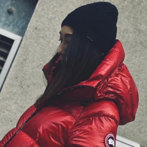
Due West wanted to give the same experience to their online customers as to what their customer retail store customer receive. With a full redesign from Blend, we helped the business significantly lift orders and revenue.
The Problem
Due West wanted to improve the design, look, and user experience of their website. They were looking for a high-end e-commerce store rather than a site that looked like a portfolio of fashion images.
They wanted to implement a number of customisations, such as custom functionality, custom Homepages and internal Pages, and customisations to the product pages. Due West was looking for a team that could help them steadily progress their growth through well-thought-out updates.
Essentially, Due West has two major parts to their website: Streetwear and Outerwear. They wanted to accommodate the subdivision menus for customers shopping in either of these two categories. Blend had pinpointed that this was harming conversion through our analysis, and this needed to be addressed as a priority.
Due West discussed that they wanted these preferences to be saved so that any subsequent visits would direct customers to the preference that they opted for on their first visit. Blend felt that this was a great option that could make an impact on their conversion. These custom Homepages and internal pages need to be designed in a way to let customers navigate to their desired subdivisions on the store quickly and easily so that the customer experience was geared towards helping them find the products they really wanted.

What We Did To Help
Following Blend’s initial discussions with Due West, we understood that they had promotions just about everywhere on their site, and we opted to use the Flex Theme by Out of the Sandbox to support these Mega Menus. They wanted in-depth Mega Menus with no simple drop-down menus. There were also plenty of columns, collections, images and promotions and this was something that the Flex Theme does well. We felt that this would mean that shoppers would have a much easier way of finding the products that they wanted, but were not necessarily aware of.
One of the challenges with this project was that our client wanted the ability to toggle through product images on the collection page as well as an add-to-cart button added to each product image. The logic here was that customers who shop online also shopped in-store, and together, Blend and Due West decided that this would give some of the same experience online, as it does in-store. This needed to be done in such a way that site speed wouldn’t be affected, so we created a dynamic, custom solution to make this a reality.
Given the number of brands and products, we also improved the filtering on the Due West site using an app called Filter Tools, so that filters are categorised into groups, for example, colour, product type or brand. They are dynamically shown or hidden appropriately for each collection, so we can be sure that we’re providing the customer with clear signposting to the products they’re looking for.


The Results
Three months after the redesign with Blend, Due West saw the following metric changes from the same period as the previous year.
(Metrics based on the 90-days post launch compared to the previous year)
-
49%
Increase in Online Store Revenue -
41%
Increase in Total Orders -
26%
Increase in Online Store Sessions
More Case Studies
-
 TEKLED
How a Shopify Redesign Boosted TEKLED’s UK eCommerce Growth
Discover how a full Shopify redesign improved UX, SEO, and site performance, driving higher conversions and order values for TEKLED’s UK store.
-
 Titan Casket
Titan Casket's Metrics within 3 Months of a CRO Implementation Program
Titan Casket increased revenue, conversion rate, and total sales within 3 months using Blend’s CRO Insights and CRO Implementation Services. See how focused CRO delivered.
-
 Azuna
AzunaHow Blend's CRO Implementation Sparked Growth Within 3 Months
In just three months, Blend helped Azuna boost conversion rates by 7% and checkouts by 29% through data-led CRO testing focused on mobile UX, product swatches, and search visibility.
CONTACT US
Get in touch with the Shopify CRO experts at Blend Commerce
CONTACT US
Get in touch with the Shopify CRO experts at Blend Commerce
Here’s what to expect:
- After you get in touch, one of the Blend Directors will reach out within 1 business day.
- We'll ask for more detail about your business to assess whether Blend is the right fit, and if not, we'll recommend someone who is.
- If it looks like we can help, you’ll be invited to a call to dig into the challenges you’re facing and the numbers behind them.
- From there, we’ll outline clear steps to help get things on track.


