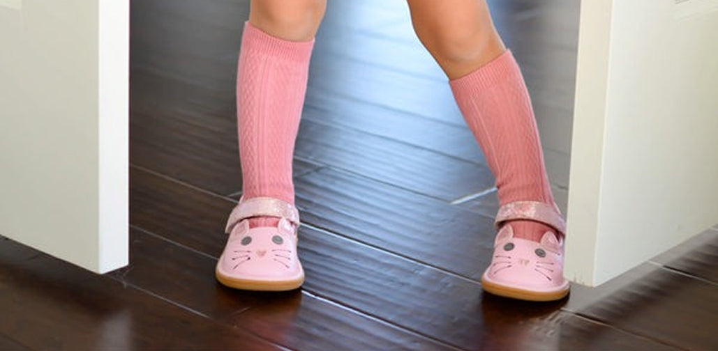
Wee Squeak is a leading children's shoe brand, based in Canada. Wee Squeak wanted to increase their conversion rate from mobile traffic, and Blend achieved this with a customised Out of the Sandbox Turbo theme.
The Problem
Wee Squeak had seen their mobile traffic growth rise from 50% to 80% in just three months. Their mobile conversion was tracking at less than 2%, significantly under the desktop conversion rate of the store. Due to changing customer behaviour, Wee Squeak needed to adapt their approach to ensure that conversion rate on mobile, was a closer match to their desktop conversion rate.

What We Did To Help
Using our team’s deep experience of Out of the Sandbox themes, Blend initially decided that using the Turbo theme would be the best fit for Wee Squeak and their customer demographic. Our design team then began to look at mobile design features used with previous clients and discussed with the project lead on how these could specifically help achieve an increase in mobile conversion that Wee Squeak was looking for.
Through an initial discovery workshop with Susan, the Blend team were able to analyse data from the Wee Squeak store and review this in a real-world context with Susan’s support. As the project moved to the initial design concept stage, the Blend team were conscious to keep the key objective of the project as the focus.
The project with Wee Squeak was delivered and implemented over the course of 9 weeks and the redesigned Wee Squeak Shopify store was created using the following key implementations:
- Turbo theme
Based on Wee Squeaks requirements to optimise mobile, Turbo was best suited to her needs. - Mobile-first design
As the Wee Squeak traffic was 80% mobile, all design decisions were taken in favour of mobile-first to maximise overall conversions for the store. - Product page optimisation
Based on user data from the Wee Squeak store, product pages were optimised for increased conversion, specifically by improving the user experience of viewing product details. - Klaviyo integration
As mobile optimisations were key, migrating Wee Squeak to Klaviyo from MailChimp was critical to helping achieve this goal.


The Results
For the Blend team, the key metric here was the increase in mobile conversion rate. By achieving this, Blend was able to have a significant impact on both the long and short term sales of Wee Squeak by impacting on the biggest proportion of the store's traffic. By combining the objectives of entrepreneurs with hard data from Shopify stores, Blend is able to create and execute plans that make a real difference to the bottom line.
-
26%
Increase in Mobile Conversion rate -
16%
Increase in Overall Conversion Rate -
40%
Increase in Revenue from mobile
More Case Studies
-

How Long-Term CRO Drove Sustained Growth for a Sports Nutrition Brand
See how an Ireland-based sports nutrition brand achieved sustained eCommerce growth through long-term CRO, improving conversion rate, revenue per visitor, and subscription adoption year on year.
-
 Stone Creek Coffee
Stone Creek Coffee Shopify CRO Case Study: Results After 3 Months
See how Blend’s CRO implementation improved conversion rate, revenue per visitor, and subscription performance for Stone Creek Coffee in just 3 months.
-
 TEKLED
How a Shopify Redesign Boosted TEKLED’s UK eCommerce Growth
Discover how a full Shopify redesign improved UX, SEO, and site performance, driving higher conversions and order values for TEKLED’s UK store.
CONTACT US
Get in touch with the Shopify CRO experts at Blend Commerce
CONTACT US
Get in touch with the Shopify CRO experts at Blend Commerce
Here’s what to expect:
- After you get in touch, one of the Blend Directors will reach out within 1 business day.
- We'll ask for more detail about your business to assess whether Blend is the right fit, and if not, we'll recommend someone who is.
- If it looks like we can help, you’ll be invited to a call to dig into the challenges you’re facing and the numbers behind them.
- From there, we’ll outline clear steps to help get things on track.


