The Approach
We focused on where sports nutrition shoppers tend to pause: when they’re comparing products, weighing up subscription, and making the jump from cart to checkout. To remove those sticking points, we tightened up value messaging on PDPs, made the subscription offer easier to understand, and reduced friction in the checkout flow so ready-to-buy customers can finish faster.
Because the UK store is mobile-led, we were careful with anything that added extra taps or visual complexity, and let the data guide what worked best on mobile vs desktop. Finally, we validated changes through A/B testing, so the brand could scale proven wins and build a long-term optimisation roadmap with confidence.
A/B Test 1: Pricing Strategy (Per Dose / Per Capsule Pricing)
When shoppers are choosing between products, price is rarely evaluated as “the total”. It is evaluated as “what am I paying per serving?” If customers have to do that maths themselves, the decision slows down and hesitation increases. Clear unit pricing removes the mental work and makes value easier to recognise quickly.
What We Tested
We tested whether displaying pricing on a per-dose or per-capsule basis would improve purchase confidence, increase Revenue per Visitor, and support subscription selection.
The Test
Original: Standard price displayed only (no unit price framing).
Variant 1: Added per-unit pricing context (for example, per dose / per capsule), tailored to the product’s serving format.
Result (Winner: Variant 1)
- +3.40% increase in eCommerce Conversion Rate
- +17.76% increase in Revenue per Visitor
- +5.81% increase in Select Autoship Option (Click on Autoship)
- +23% increase in clicks on Add to Bag
Why This Worked
Per-unit pricing made the product feel more affordable and easier to justify without changing the actual price. It reframed the cost into something customers could evaluate instantly, which reduced hesitation and increased commitment. That clarity also supported subscription behaviour, because once the unit cost feels reasonable, the recurring purchase feels like a smarter decision rather than a bigger commitment.
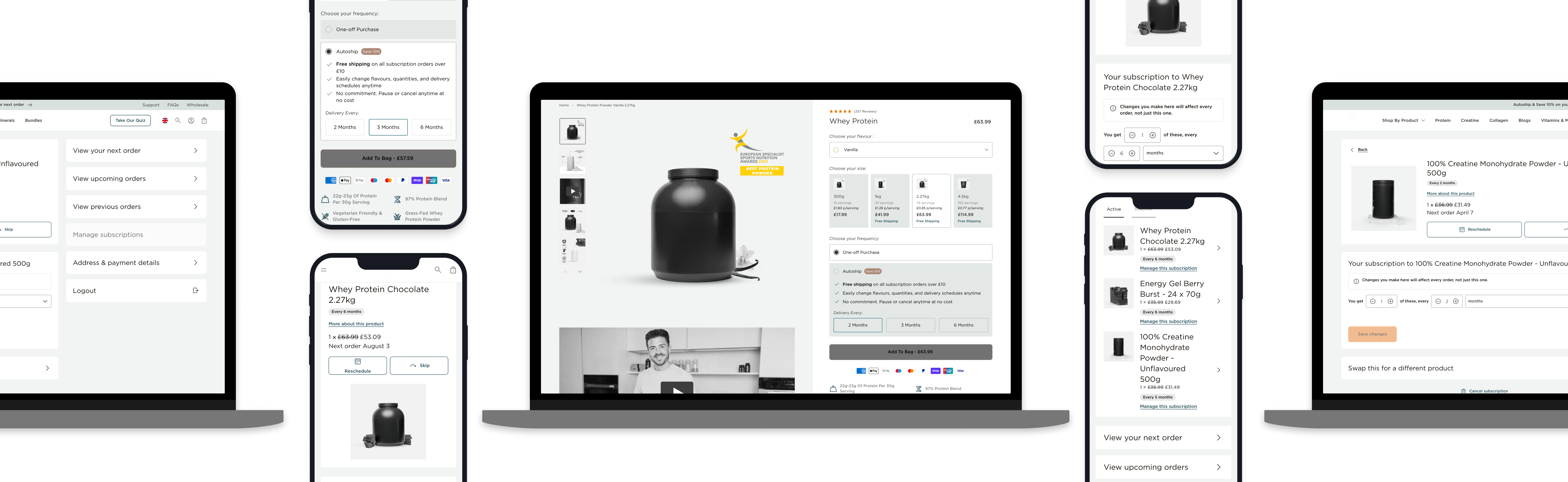
A/B Test 2: Displaying Both Subscription and One-Time Purchase Prices on Product Cards (Collection Pages)
Collection pages are often used to compare options quickly. If subscription savings only appear later on the PDP, some customers never see the value difference at the moment they are deciding what to click. Showing both prices early can make the subscription benefit tangible, but it can also introduce interaction friction, especially on mobile.
What We Tested
We tested whether adding subscription pricing to collection product cards would improve conversion and subscription adoption, while still supporting quick add-to-cart behaviour.
The Test
Original: Only one-time purchase price shown on product cards. Collection page add-to-cart supports one-time purchase only.
Variant 1: Show both one-time and subscription prices on product cards (for example, £63.99 and £57.59).
Variant 2: Allow customers to select one-time or subscription from the card without showing both prices upfront.
Result (Winner by Device)
Mobile Devices (80% of traffic) - Winner: Original
Variant 1 vs Original
- -23% decrease in eCommerce Conversion Rate
- -31% decrease in Revenue per Visitor
- +59.31% increase in Select Autoship Option (Click on Autoship)
Variant 2 vs Original
- -26% decrease in eCommerce Conversion Rate
- -38% decrease in Revenue per Visitor
- +35.37% increase in Select Autoship Option (Click on Autoship)
Desktop Devices (20% of traffic) - Winner: Variant 2 (and strong desktop performance overall)
Variant 1 vs Original
- +125% increase in eCommerce Conversion Rate
- +136% increase in Revenue per Visitor
- -72% decrease in Select Autoship Option (Click on Autoship)
Variant 2 vs Original
- +227% increase in eCommerce Conversion Rate
- +548% increase in Revenue per Visitor
- +20% increase in Select Autoship Option (Click on Autoship)
Rollout Decision
- Desktop: Publish Variant 2 on desktop devices
- Mobile: Keep the Original
Why This Worked
On desktop, the design shift supported faster decision-making and enabled more customers to add products directly from the collection page with less effort. Desktop users also have more precise control and space for comparison, so the extra pricing or selection mechanics did not create friction.
On mobile, the same interaction became too heavy. When customers had to engage with dropdowns or options that took over the screen, the flow became slower and more error-prone, which hurt conversion even though Autoship clicks increased. The test proved that subscription intent can be increased on mobile, but the UI pattern needs to be lighter and more visually clear to avoid harming completion.
A/B Test 3: Adding an Express Checkout Button in the Smart Cart
When customers add a product to cart, they are often at peak intent. If the next step requires multiple clicks and page loads, some of that intent is lost. Express checkout reduces the time between “I want this” and “I’ve paid”, which is especially valuable on mobile.
What We Tested
We tested whether introducing express checkout options directly in the cart drawer would reduce friction and improve conversion and revenue per visitor.
The Test
- Original: No express checkout option shown in the smart cart.
- Variant 1: Express checkout button shown in the smart cart.
Results (Winner: Variant 1)
Overall:
- +6.79% increase in eCommerce Conversion Rate
- +26.20% increase in Revenue per Visitor
Mobile:
- +16.46% increase in eCommerce Conversion Rate
- +53.29% increase in Revenue per Visitor
Desktop:
- +1.79% increase in eCommerce Conversion Rate
- +3.32% increase in Revenue per Visitor
Why This Worked
Express checkout worked because it reduced friction at the moment customers were most ready to complete the purchase. The impact was strongest on mobile, where shoppers are more likely to check out immediately and are less tolerant of additional steps. By letting customers move straight from cart to payment, the experience captured intent before it had time to fade.
A/B Test 4: Adding Key Value Propositions to All Product Detail Pages
Some PDPs already included value propositions, while others did not. This created inconsistency in how clearly products communicated their benefits. In sports nutrition, customers often decide quickly, and the lack of clear on-page reassurance can reduce confidence at the point of purchase.
What We Tested
We tested whether rolling out key value propositions across PDPs would improve engagement and conversion, and whether brand-based propositions or product-based propositions performed better.
The Test
Original: No value propositions.
Variant 1: Brand-based propositions (trust and brand reassurance).
Variant 2: Product-based propositions (benefits specific to the product).
Result (Winner: Variant 1)
Variant 1 vs Original (Brand-Based Propositions)
- -8.84% in Engagement
- +149.71% in Conversion Rate
Variant 2 vs Original (Brand-Based Propositions)
- +4.38% in Engagement
- +66.47% in Conversion Rate
With a statistical significance of 94.91% for Variation 1, we recommended ending the test with Variation 1 as the winner for Kinetica UK.
Why This Worked
Brand-based propositions performed best because they reduced perceived risk quickly. They gave shoppers confidence in the brand before asking them to assess product details. Even when engagement fell, conversion rose significantly, which suggests customers needed reassurance more than they needed more content. Once trust is established, commitment becomes easier.
Implementation: Subscription Optimisations
Subscriptions were a key long-term lever for the brand, but growth depends on more than offering a discount. Customers need to understand what subscribing means, what they gain, and what control they retain before they will commit. To support this, we improved subscription choice and education across the journey, focusing on clarity, reassurance, and reducing the “unknowns” that typically stall adoption.
Improving subscription choice at the point of purchase
On PDPs, we improved subscription frequency selection by adding a clear decision cue within the cadence options. The 4-week frequency was labelled as “Popular”, giving customers an immediate reference point at the moment they are choosing how often they want deliveries.
Instead of asking customers to interpret multiple options with no guidance, this experience highlights the cadence most customers choose, which increases confidence and reduces hesitation. Customers still have full control to select a different interval, but the selection process feels simpler and more reassuring, which supports both subscription adoption and overall conversion.
Educating customers before they reach the PDP
We added a dedicated subscription education section to the homepage so people understand the subscription option before they ever reach a product page. Instead of introducing subscriptions at the moment a shopper is trying to decide what to buy, the homepage section does the groundwork early by explaining the benefit in simple terms and making it clear that subscriptions are flexible, so it doesn’t feel like you’re locking yourself into something.
From there, we directed users to a subscription landing page, which does the heavier lifting by answering the obvious questions and removing common worries, helping more shoppers feel comfortable choosing subscription when they land on a PDP.


 Food & BeverageJackson's
 Home & GardenVegepod
 Other RetailOaktree Memorials

