PerTronix
Close All Filters on Collections by Default
A/B Test
What the Data Told Us
When looking through the clientβs site to determine any elements which might cause friction, we analysed the filters on collection pages. Due to the industry, the filters are extensive and necessary, but they took up mental focus when trying to determine which products the user needs.
Hypothesis
How the Test was Set Up
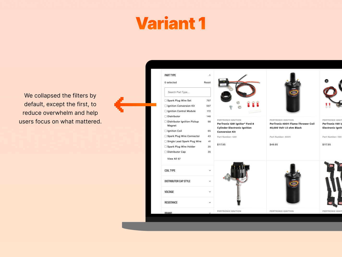
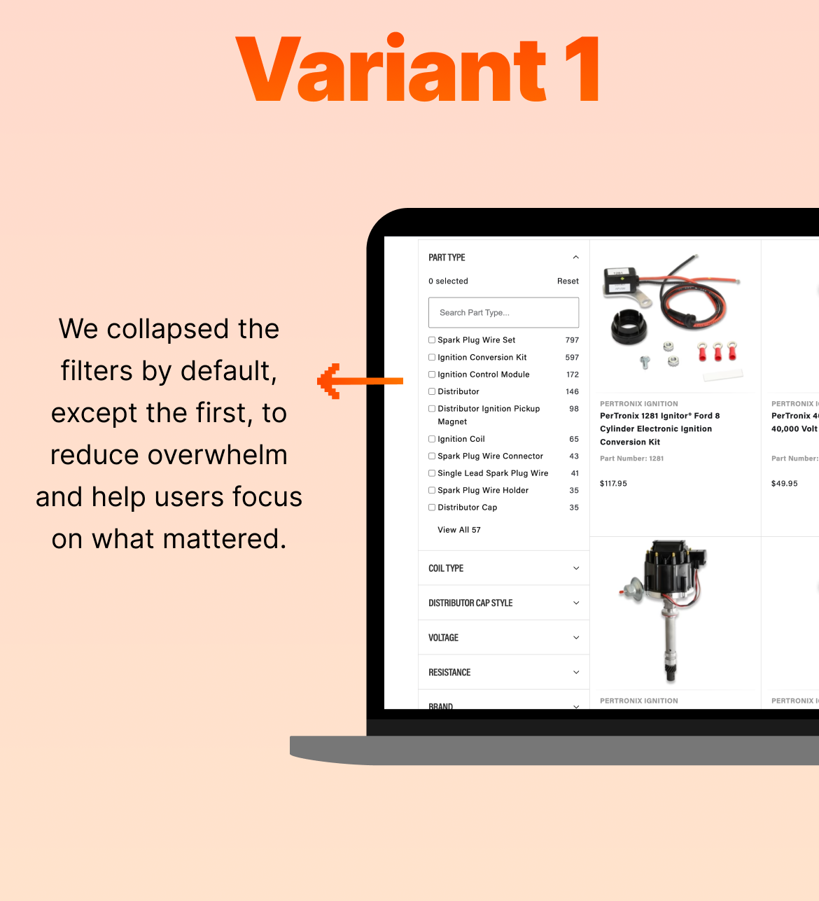
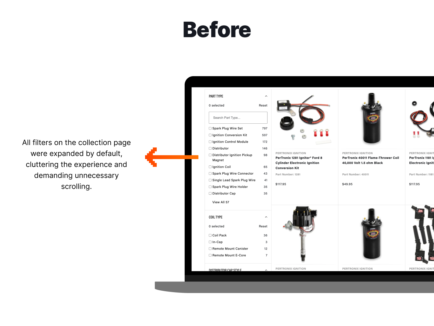
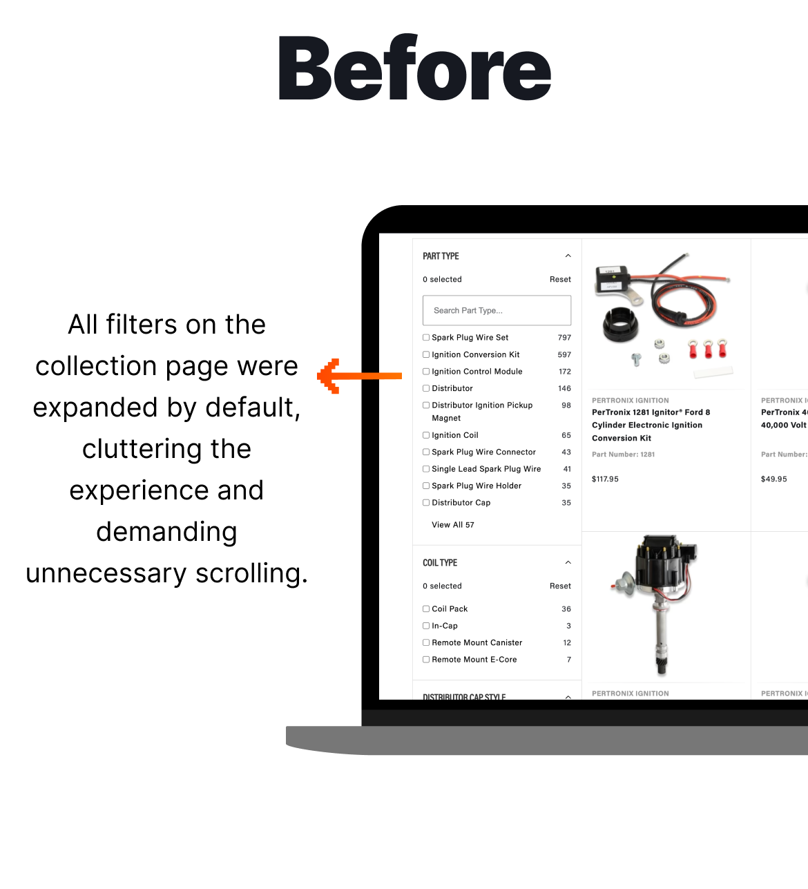
We hypothesised that by closing the filters by default, the user could edit only the filters they were looking for at a glance. We created a variant where all the filters were closed by default, except the first one, while the original (control) presented all filters open, requiring users to scroll to see all available filters.
The Results
After two weeks, we analysed the data which was interesting. Collapsing the filters by default appeared to have create a less overwhelming, more streamlined first impression, which lead to a healthy 6.06% increase in Conversion Rate. We also noted a 235% increase in filter clicks, indicating that users still found and interacted with the filters, and likely more intentionally. The change didnβt reduce usability but rather improved perceived control.
We implemented Variant 1 permanently.
-
6.06%
Increase in Conversion Rate -
235%
Increase in Clicks on Filters -
45.89%
Increase in Clicks on Cart
2025
WINNER
Standout CRO Agency of the Year
2025
WINNER
eCommerce Agency of the Year (small)
2025
WINNER
Agency of the Year (Medium)
2025
WINNER
CRO Agency of the Year
2022
WINNER
CRO Agency of the Year
2022
WINNER
CRO Agency of the Year
2022
WINNER
Dev Agency of the Year
See More A/B Tests
-
Product Page (PDP)Adding a Back Link to PDPs Improves Mobile Revenue per Visitor
A simple βBack to Resultsβ link helped mobile shoppers return to browsing more easily and delivered a projected monthly revenue lift.
-
Product Page (PDP)Accordion PDP Content Improves Desktop Conversion
Structuring PDP content into accordions created a strong desktop win, and showed why mobile shoppers need key information visible sooner.
-
Search & NavigationRedesigning the Mobile Category Menu Strengthens Funnel Engagement
A redesigned mobile category menu helped shoppers move more confidently from browsing to cart and checkout.