Starting your website design on a blank canvas isn’t always helpful—just like starting with an overcrowded template will distract you from what your brand stands for, a blank canvas will have you questioning your every design decision. Designing your Shopify store isn’t just about making it look pretty; it’s about ensuring that your customers know exactly what they’re getting and where they should go—it's about boosting your Conversion Rate Optimisation.
For example, if your store was written in Elvish, would everyone know exactly what products or services you offered just by looking at your landing page?

When we’re conducting a Shopify web design at Blend, we ensure to focus on enhancing the customer journey while also taking into account the crucial design aspects you should never leave out. While we always talk about Customer Value Optimisation and how you should focus on the overall view of your eCommerce store and not just Conversion Rate Optimisation, today we’re talking about what you should keep in mind when designing your Shopify store to enhance your conversion rate optimisation.
Let’s start with the design elements before moving on to design hierarchy.
The 6 Important Design Elements for Your Shopify Store
There are many elements to ensure you have in your design, but as this is just one minuscule blog, you’ll have to deal with a quick crash course in design elements and the ones you need to focus on when it comes to designing your Shopify store (or redesigning your Shopify store if you’re looking to shake things up). We’re going to focus on the 6 most important design elements for your Shopify store: your headline, the use of imagery and videos on-site, the features and benefits communicated, the amount of credibility displayed, your expectation managers, and lastly, your call-to-action (CTA) buttons.
While we are talking design, it’s important not to forget about your copy. Many feel that it’s a battle of tug-of-war between designers and copywriters, but the truth is that you can’t have one without the other and teaming up is the best solution to increase conversion rates on your Shopify store.
1. Designing Your Headline for Your Shopify Store
One of the most crucial things is to communicate with your customers the second they enter your site. So ensuring that your headline communicates your value proposition in the correct manner is something to keep an eye on. You’re looking for bolded fonts with contrasting colours that stand out and hold the attention of the reader. Make sure you have enough spacing around your headline to make it easy to read as well.
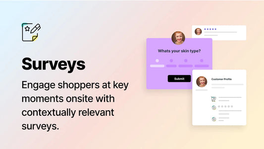
2. Using the Correct Imagery on Your Shopify Store
Ensuring you have relevant imagery and videos on your Shopify store is of the utmost importance. Remember, if your store is in a completely different language to the reader’s home language, they should still immediately be able to know exactly what products or services you offer. Your imagery should also support the copy nearby. For example, an image near your headline should support and convey your value proposition.
3. Communicating the Benefits of Your Ecommerce Brand
Like with your headline and imagery, all design communicates with your customers—not only the copy. Ensure to communicate why customers should choose your brand over others for the same products or services. This could be communicated within a clever value proposition or a checklist below the fold. Either way, it’s good to think about the questions customers may have when entering your Shopify store and deciding whether or not you are answering these questions efficiently.
4. Make Your Shopify Store Credible
These days most things are done online, but that doesn’t mean that customers blindly trust everything on the internet. While many search their medical issues on Google instead of visiting a doctor, customers looking to purchase your products will likely question whether or not they can trust your brand at least once while on your site. Increasing the credibility of your Shopify store can be anything from the logos of companies that your eCommerce brand has partnered with in the past to social proof like reviews or testimonials from other customers. Ensure the copy is in a bolded font with sufficient space between the lines to draw the eye and hold the attention of the reader (make sure these come from real people with first names to prove that they’re not just something you made up).

5. How to Manage Customer Expectations on Your Shopify Store
Managing the expectations of customers visiting your eCommerce store is vital to ensure you don’t surprise them at checkout, causing them to bounce. Customers like to be given all information almost simultaneously. This can be communicated quickly and simply by pulling in your copywriter buddy and ensuring whatever important information is communicated, like 30-day guarantees, cost of shipping, shipping times, and packaging choices (among many, many more things that you may need to communicate).
6. Enhancing Your Call-to-Action Buttons
Remember that this is the entire goal of your site—to get them to press that button. Whether it’s ‘Buy Now’, ‘Sign Up’, or ‘Add to Cart’, the design of your CTA will either encourage your visitors to purchase or be completely lost on them. Ensure that there’s only one. Having a page littered with buttons to click makes for a confusing customer journey, so stick to one main goal. Ensure the colour of your CTA matches your brand while standing out on your page, and make sure the copy in your CTA directly communicates what will happen when they press it. Don’t take them through repetitive loops to get to where they need to go.
Now that we’ve had a quick look at the 6 elements of design on your Shopify store, we want to take you through another 6 items, but this time it’s about visual hierarchy.
The 6 Aspects of Design Hierarchy for Your Shopify Store
Visual hierarchy is in what order certain elements should appear on your site, in your email marketing, etc. The correct visual hierarchy will pull the reader’s eyes to where you want them to be and guide them to what you want them to do—like clicking that ‘Buy Now’ button.
Essentially, you want your website to say, ‘look here’, ‘now look here’, ‘look here’, ‘good job, now click this’. Your site should not only be easy on the eye but also informative and, well, not boring. So let’s get into the 6 most important aspects of design hierarchy for your Shopify store: size, space, font, colour, contrast, and direction.
1. Why Size is Important in Your Site’s Visual Hierarchy
Size is important because, as humans, we automatically put different-sized items in a hierarchy of their own—we feel some are more important than others based on their size. Like this, for example.

You may be inclined to say the largest circle is the most important, and you’d be in the overwhelming majority of people who would choose that one. Size allows you to have something specific stand out above the rest. The most important part of your site should be the largest, with secondary elements being medium and the least important being smaller.
2. How to Effectively Use Space in Your Shopify Store
To be quick about it, you don’t have to fill every single space available on your site. It just makes it confusing and overwhelming for the visitor, and they won’t know where to look. Many may feel that what we call ‘white space’ is wasted real estate, but it’s important to have at least some level of white space on your site. Space allows your customers to breathe while visiting your store and easily find where they should go next.
3. Using the Right Fonts on Your Shopify Store
The third item on the list is the fonts you use and how you use them. Ensure that you don’t try to be too fancy with drop shadows and different coloured fonts—it’s not your school Word project. Make it easy to read. One of the greatest pieces of advice is to use san serif, a font without ‘feet’. They’re clean and very easy for customers to scan. And remember that your size hierarchy also comes into play with your fonts. Make the most important sections of your copy, like your value proposition, stand out. A general guideline is 32 to 40 pixels for your primary headline and 20 to 24 pixels for the body copy. It’s not recommended to go smaller than 16 pixels (keep those with seeing disabilities in mind here).
4. How to Use Colour in Your eCommerce Store
Colour is like an arrow pointing customers to where they should go. Let’s do a test with our circles again. In this image, all circles seem equal. While looking, you will likely just scan across them without knowing exactly where to look.

Now let’s add just one splash of colour (Blend’s colour, obviously).

You knew exactly where to look, right? You didn’t even have to try. It was instantaneous. Your brain did it all by itself without any effort. This is the kind of impact that the correct use of colour on your Shopify store can have on your conversion rate. Simply guiding your customers with the correct use of colour will boost your conversation rate for your eCommerce store.
5. How to Use Contrast on Your Shopify Store
There’s not much to say on this one. Why? We just displayed the impact of contrast in our colour section. The simple contrast of the colour versus the lack of colour immediately drew your eye to where it should be. Using contrast in conjunction with colour, you’ll be able to not only increase the conversion rate on your Shopify store but also make the customer journey as easy as possible.
6. What Direction Means for Your Shopify Store
Direction is our last aspect of visual hierarchy, and it’s an interesting one. Your content should point the customers to where they need to be. For example, the CTA on this site is clearly the orange button, but the people in the background are drawing a substantial amount of attention and are looking where? Away from the CTA.

Ensure your graphics and design hierarchy are all pointing in the same direction.
How Blend Uses Design to Increase Conversion Rate Optimisation
At Blend, we focus on all these elements and aspects and more, including who your target audience is, where they are in their customer journey, what your brand stands for, and more to boost the overall metrics of your store—not just conversion rate. Our Customer Value Optimisation approach is unique in that it focuses on the big picture of all your metrics, including AOV, CLV, CR, and more.
If you’re looking for the perfect team to implement these changes to your Shopify store design, get in touch with Blend today and let’s start brainstorming.

Published: July 14 2023